Bad designs are among us! Ack! Who the hell thought this was a good idea? Join me on a short, infuriating experience, and see some other examples of the horrors that surround us every day.
When we create something, we have a reason for it. Even if that reason is “for kicks and giggles.” A lot of those creations are kept private. Others are released into the world with the goal of having others use them. If you’re creating something, and it falls into that last category, then please _think_ about how those other people are going to use and experience your creation. Otherwise, you may end up with some raw eggs cracked over your head.
## The Silent Screaming Car Ride
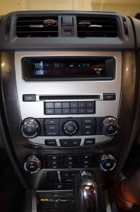
My friend swung by in his Ford Fusion. I hopped in and a minute later we’re zipping down the Interstate. Our drive-plan consisted of a 30 minute jaunt to a great restaurant to meet up with some more people. He tells me to put some Pandora on using his iPhone since he doesn’t pay for satellite radio, so I snatch it out of the cup holder. The series of events that followed nearly culminated in a plan to track down the culprits behind the atrocity experienced and crack some eggs on their heads. I assure you, they would be getting off easy.
The Fusion had Microsoft SYNC and we’ve used the Bluetooth link before, but today it just wasn’t working for us. The phone and SYNC simply refused to negotiate the connection. O.k.. Turn the phone’s Bluetooth off and on. Nothing. Turn phone off and on. Nothing. Turn SYNC Bluetooth off and on. Nothing.
Every time we retry, we have to change from AM/FM radio to the iPhone’s Bluetooth connection. That process goes like this:
* Menu
* Menu
* Menu
* Menu (yes, the menu button must really be pressed four flippin’ times!)
* OK
* OK
* Clockwise twist
* OK
* Twist to find phone (one line at a time)
* OK
If it works, music should start playing from the phone. About bloody time! You have to repeat this process every time you switch from radio to the iPhone Bluetooth connection, or line in.
But the connection still wasn’t working, so I was going to try deleting and re-adding the phone on the SYNC side.
* Menu
* Menu
* Menu
* Menu
* Rotate to find “system settings”
* OK
* Rotate to find “Bluetooth settings”
* OK
* Rotate to find “Delete Device”
* OK
* Rotate to find phone in list
* OK
* OK
The device was deleted. Yay! Now let’s do that all over again and find “Add Device” instead. At last, there it is. The really annoying automated voice that Microsoft uses comes through the car stereo saying that the car must be stopped in order to add new Bluetooth devices.
It was at this point in time that the car radio narrowly escaped a swift kick in the face. My rage, which is tamed here in writing, was that whoever or whatever committee that made this fucking piece of shit should lose their jobs and be barred from working in the same field forever if not willing to confess their crimes and beg for mercy.
Presumably this block is a safeguard put into place to keep drivers from becoming distracted trying to get their phone working, but this is even more annoying than those popups that appear in navigation apps where you have to confirm that “I’m the passenger”. I’m looking at you Waze and now iOS 6 Maps. Bugger off! Your incessant dialog box isn’t going to discourage drivers from using the app and it will probably cause more of a distraction than if you had just gotten to the point and shown the damn map.
How has the prevention of adding a new Bluetooth connected phone contributed to the reduction of driver distraction? The user has already navigated the horribly designed interface to get to this point. The answer is, it hasn’t. Whoever thought this was a great idea to reduce distraction in the car has no clue. And yet, thank God we can still delete the phone which is just a rotation of the dial in the opposite direction.
Whoever engineered this didn’t _think_. What is the purpose of a car audio system? It’s meant to do one thing: play my damned music.
## The Inkless Printer
I’m about ready to walk out the door and need to print a 20 page document, so I turn to the only thing in the house. An HP Officejet 8500. Everything moved along nicely until page 4. At which point, the printer spits out a half printed page and throws an error message that it’s “out of ink.”
I scavenge around, but can find none of the missing color. The document looks just fine, without any of the typical symptoms that ink is running out.
So I power cycle the printer, reinitialize, and send the print job again. This time it manages 6 pages before just stopping and refusing to budge further. I repeat the cumbersome power cycle process until I get the last remaining pages out of the printer. The last page still shows no indication that the ink cartridge is running out.
Was this a slimy business move to sell more ink? Perhaps it was the nobler option–nobody likes faint or impossible to read documents that just waste paper. Maybe the engineers were trying to be smart about this, or maybe it was decided by committee. I don’t know. But I do know that if a device says that it’s out of ink when it’s really not, then by golly you better not fool yourself into believing that you can make such a drastic prediction as to make the printer stop half way through a printed page because you might or might not be running low on ink.
_Think_ about how people are going to use your creations. Yes, people want elegant looking pages, but in a crunch it doesn’t matter if there are a few faint lines because the cartridge is running low. Something is better than nothing at all.
## Example: Windows Notepad
Try opening a document that’s located in a restricted area by double clicking on it, such as C:\test.txt. You will find that you are unable to save any changes you make to the file because you don’t have permissions. That’s fine, but no way of granting or authorizing the changes is provided. Seemingly the only way to do so is to first open the document editor “As Administrator” and then open the document you want to edit through the File menu.
Why not just prompt the user to authorize the changes? Every other Operating System seems to know how to do this. Windows Vista introduced those ridiculous security alert windows on nearly every action asking for permission, and yet, it can’t do the same when the user is actually trying to do something useful explicitly.
## Example: Windows 8 Video Player Overlays
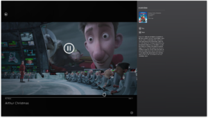
The gigantic play button obtrusively overlaps on top of video that’s playing, and then lingers for an annoyingly long period of time. Yes, users need a way of manipulating the playback of a movie, but showing a big ass button on top of the video that’s playing when the user is just checking how much time is left, or by accidentally moving the mouse, is downright rude and disrespectful.
## Example: Microsoft Exchange and Images
Do you use Microsoft Exchange? Ever received an email with an image that you would have liked to save? Sorry, you can’t do that easily. No drag and drop for you. Not even a copy/paste to the desktop. Nope. Instead, you must copy the image, paste it into another program such as Paint, crop it, and then save it as a jpeg. No wonder the corporate world sucks so very very much.
## My Plea
I’m not intentionally picking on Microsoft. They just happened to be the makers that annoyed me the most this week and whose examples are so blindingly bad. Bad designs can, and are, made by everyone. They’re all around us. Even I’m guilty, but I try to keep the majority of it to projects that I release “as-is.”
If you are a creator, I beseech you to actually think how people will use your creations. There’s a difference between something not working well for a purpose that it was never intended for, and something not working well at precisely the task it was created for. Salt is rubbed in the wound when the user has had to pay for something that doesn’t work well at performing the core functionality as advertised.


I most assuredly agree, on the printer thing my parents bought a nice Epsom Photo printer several years back, it had 5 cartridges for different colors. Great for photo printing. The issue being that if ANY of the cartridges were empty, it would let you print ANYTHING! Printers thinking was this, Oh i see your Pink cartidge is empty, NOPE i can’t let you print that document for school even through all the text is black. Needless to say, it didn’t last long.
Another design issue that drives me nuts goes to mobile apps. I like to listen to music on my phone, i like to play games on my phone, and often times to two activities overlap. Which brings me to my point every game app should have controls to turn off all sounds, i NEVER listen to the sounds when i play a game. i should ALWAYS have the option to disable them FOR JUST THAT APP. I don’t want to disable sound on my phone completely i want to listen to the music and the music alone.
Good post i like it.