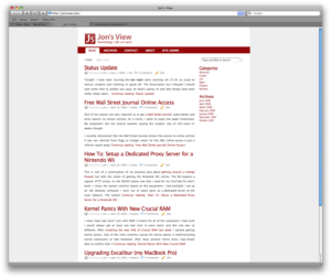
I finally got my act together over the weekend and whipped out a new design for jonsview.com and it is a big improvement over the old (non)design I think we can all agree. The new look is based on the popular k2 theme with a few tweaks. Besides a new face there are also some new “Web 2.0” features which are just to good not to use.
Streamlined Navigation
At the top of the home page is a navigation bar that will let you navigate the archives of this website without any page reloads. Click on the <<back link and a slider bar allowing you to choose the archived date appears.
You may have also noticed that the Search box says “…Wait to Search” and that is because there is no longer a Search or Go button. About a second after you finish typing the search request will be sent and the results will immediately be shown. Give it a try, it’s neat!
Fancy Zooms
Click on almost any image on JonsView.com and the full size version will zoom in. Here is a screenshot of the website for your testing pleasure.
The Logo
Several people have pointed out that the name of the website is Jon’s View and wonder why the logo image contains the letters “Js.” I designed the logo for my personal business cards and the Js stands for my name (Jon Stacey if you’re new). Surprisingly jonstacey.com was already taken so I had to choose a different name for my website and yet figure out how to maintain a consistent personal brand. I chose to maintain consistency versus creating a 2nd logo.
What are your thoughts on the issue?


